By default, Illustrator provides a white background for your artwork:
There are two reasons why this is not optimal:
any elements of the design that are white are invisible
working on a bright white background makes it difficult to accurately perceive the colors in the design
The great masters knew this — scratch any important painting and you’ll see that it was painted on a colored background.
We’re going to change the white background to this:
The Transparency Grid
You can turn on the transparency grid by typing cmd-shift-D, or by looking under the menu View › Show Transparency Grid. Remember that command — you’ll be using it a lot!
Here’s what it looks like when we turn it on:
The default colors are unusable, but we’re going to fix that.
Document Setup
In the Control Bar (Window › Control), click on Document Setup (or type cmd-option-P):
This will launch the following panel:
We’re going to change the color of the white and gray boxes in the above image.
The key is to set them both to the same color; this will be our new background.
Just click on one of them:
Use the crayon picker, and set both rectangles to Iron color (which matches the Illustrator interface nicely).
After clicking OK, here is what the document will look like:
It’s a much nicer working environment, and depending on the project, it might even be necessary.
Tip 1: type cmd-shift-H to hide the black line around the artwork while you’re working and it’s even nicer (or menu View › Hide Artboards).
Tip 2: save a template with this setting and you’ll never have to change it again.
TLDR: Illustrator’s default swatches aren’t very good. By using a carefully conceived set of customswatches, we can replace the Color Panel and increase our creativity.
These swatches provide a complete spectrum and permit changing the colors of an object without making it brighter or darker.
A lot of time in Illustrator is spent in attributing colors to artwork.
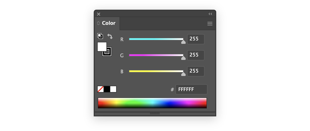
Here’s the default Color Panel:
I had always used the spectrum at the bottom to choose basic colors for a new project.
There is a problem with this technique: it’s incredibly imprecise — you can’t pick the same color twice. Each pixel of the spectrum is a different color than the others.
I might pick a nice dark blue for one element of my design, and then want to reuse it elsewhere, in the same or a different tint.
The eyedropper works to match the color, but what about other shades?
I could try click above or below the pixel on the spectrum that I clicked the first time, but the chances of getting the same hue are essentially zero.
A Spectrum Made of Swatches
I decided to replicate the spectrum panel in swatches. That way I could have the benefits of a wide choice of colors, but I could more easily pick the colors I wanted.
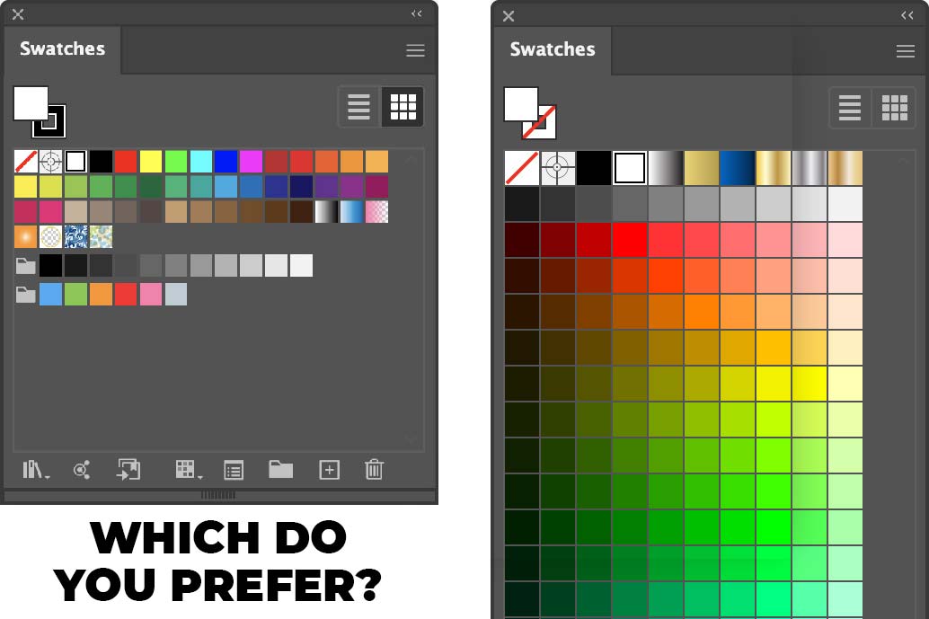
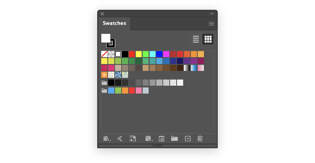
These are the default swatches offered by Illustrator:
It looks like the Illustrator team wanted to please everybody – there are at least a couple of swatches for any project you could imagine.
But, it’s chaotic and it’s not for me. I want a bunch of bright colors that encourage my creativity.
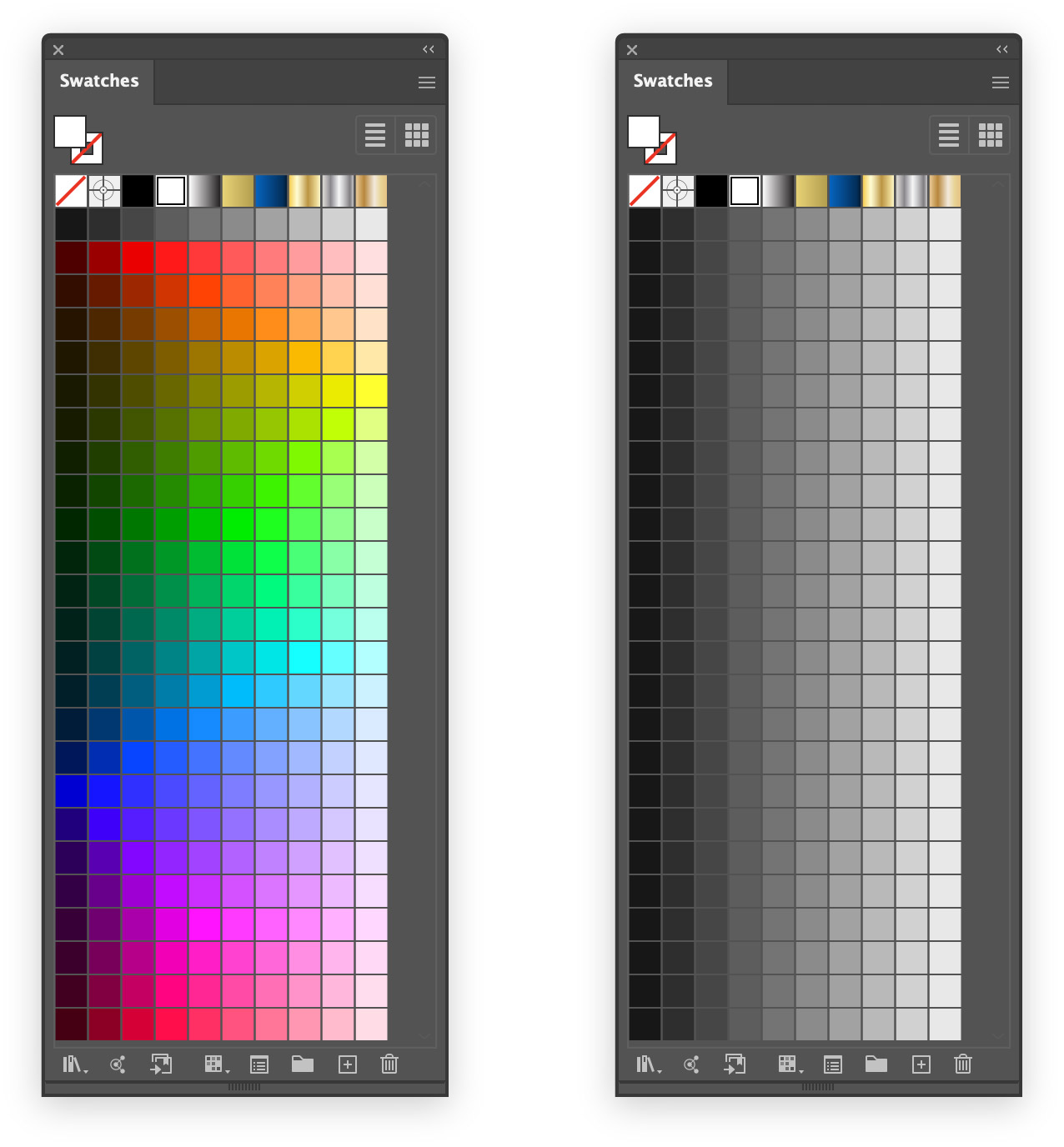
So I created custom swatches to replace the spectrum panel:
It worked well, but after a few days it started to feel limited. There just weren’t enough choices, and as we’ll see below, many of the basic RGB colors weren’t present.
I’ve been trying to get away from using the eleven basic colors for everything:
black, white and gray
red, yellow and orange
green, blue and purple
brown and pink
At the same time, I need to be able to use them when appropriate.
How Many Hues?
Adobe’s spectrum is comprised of 360 hues, and the common RGB colors are all multiples of 30:
0 · red
30 · orange
60 · yellow
120 · green
180 · cyan
240 · blue
300 · magenta
The spectrum swatches above have 15 columns, which worked out to 24° per hue — of the common RGB colors, only 0:red, 120:green and 240:blue were present.
I wanted to add more colors, but how many hue choices would be appropriate?
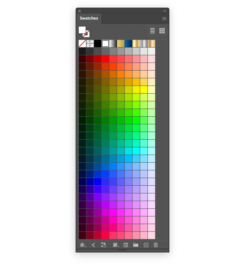
I decided to use 24 different hues: one for every 15° (24×15=360).
Fitting More Swatches
I wanted the swatches panel to look good at its default width, so I couldn’t add nine columns.
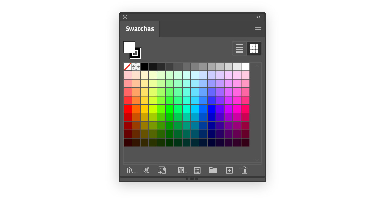
I decided to rotate the spectrum:
Using larger swatches (Medium Thumbnail View in the Swatches hamburger menu) gave me a good choice of tints, and let me use as many rows as I wanted.
This palette worked great and I could have stopped here.
We Can Do Better
After using the above swatches for a few days, an issue that had always bothered me in the background started to crystalize.
Different hues differ greatly in brightness. If I make a grayscale version of the above image, it’s obvious:
The blues are much darker than the cyans, for example, and the reds than the oranges.
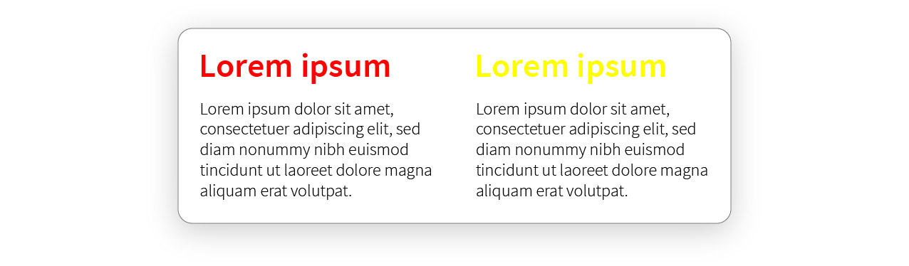
Let’s say I’m working on a simple document, and I’m trying to choose a headline color:
It would be nice to choose the appropriate brightness then experiment with different hues.
Unfortunately, since the brightness changes as I go down the swatches, I have to zigzag back and forth to find the right hue. Smallest violin, right?
What if I created a set of swatches with the same color variations, but while maintaining uniform brightness in each column?
A single column of swatches should all have the same brightness.
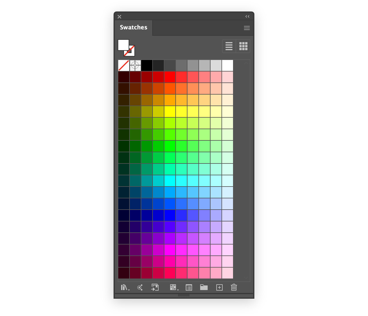
This is what I came up with:
Although the brightness is mathematically perfect, some swatches look wrong — red, yellow and blue clash with their neighboring swatches.
Manual Tweaking
To create the final swatches, I just modified the swatches that were obviously out of place. Here’s what I settled on:
I’ve been using these swatches for about a year and it’s been great.
TLDR: by default Illustrator panels are displayed in groups of three. While working, the screen quickly becomes cluttered with unused panels.
By grouping all the panels together, the workspace remains open and uncluttered — only one panel is ever open at a time, and opening a new panel automatically closes the previous panel.
This tip is for experienced users — it requires frequent use of keyboard shortcuts.
When you open a file in Illustrator, this is what you see:
A large part of the screen is occupied by tools and panels.
By default, the panels are shown in groups of two or three (Swatches and Color in the above image). The defaults never worked very well for me; the few panels I used all the time were interspersed among many panels I didn’t need at all.
I have been using Illustrator since 1995, and I have tried lots of different ways to organize the panels. I’ve stacked them and combined them in countless systems of frequently combined actions, related panels etc.
In the end, the panels always ended up getting scrambled and my Illustrator experience was needlessly chaotic.
About a year ago I had a thought: closing panels I don’t need takes a significant amount of time; if I combine all the panels into one then opening one panel will automatically close the previous panel!
Then I thought: no that’s crazy.
Then I thought: well, I’ll try it for a few days and when it doesn’t work I’ll put it back.
This is what it looks like:
As you can see, choosing panels by clicking on the title bar is no longer possible — you have to know the keyboard shortcuts to get to the panel you want.
But it’s glorious! I can see the whole document, and each time I open a panel I need, the previous panel disappears!
TLDR: for various reasons, the Effect › Stylize › Drop Shadow… effect cannot always be used. The best alternative has been Illustrator Blends, but the blending is too abrupt and visual quality suffers.
A custom ActionScript redistributes the opacity values of an Illustrator Blend, making it look almost exactly like the bitmapped Stylize effect.
I use a lot of drop shadows in my design work. Although Illustrator supports the creation of drop shadows with Effect › Stylize › Drop Shadow…, this is usually unusable for me, for a few reasons:
I’m usually building SVG web pages, and the drop shadows are stored as placed PNG images that can’t be included in the page
I’m creating a logo in a .ai file that will be placed in another document, and any placed bitmapped images are rendered as external PNG images
I’m creating assets for a macOS application and external linked images aren’t used
SVG does include the ability to create drop shadows via filters, but this has a couple of serious drawbacks:
SVG filters are rendered as pixelated images — the incredible precision of vector-based artwork is lost
SVG filters significantly slow down page drawing in Illustrator and make modifying a complex page unwieldy
Blend-based Shadows
The best solution, if it worked, would be Illustrator blends:
they’re easy to use
they’re extremely lightweight
they work perfectly with SVG pages and placed .ai files
The problem with blends is just that they look bad:
On the left is the Effects › Stylize shadow, and on the right is a blend. The edges of the blend are much less soft:
There’s no reason this should be the case. It’s just that Illustrator blindly calculates all the intermediate steps of the blend at even intervals.
A Better Blend
So I wrote a simple ActionScript that redistributes the steps of a blend along the arctangent curve.
It’s a nice S-shaped curve that’s easy to calculate in Javascript.
Here’s the result — at left is a Photoshop blur, in the middle is an Illustrator blend, and at right is the ActionScript:
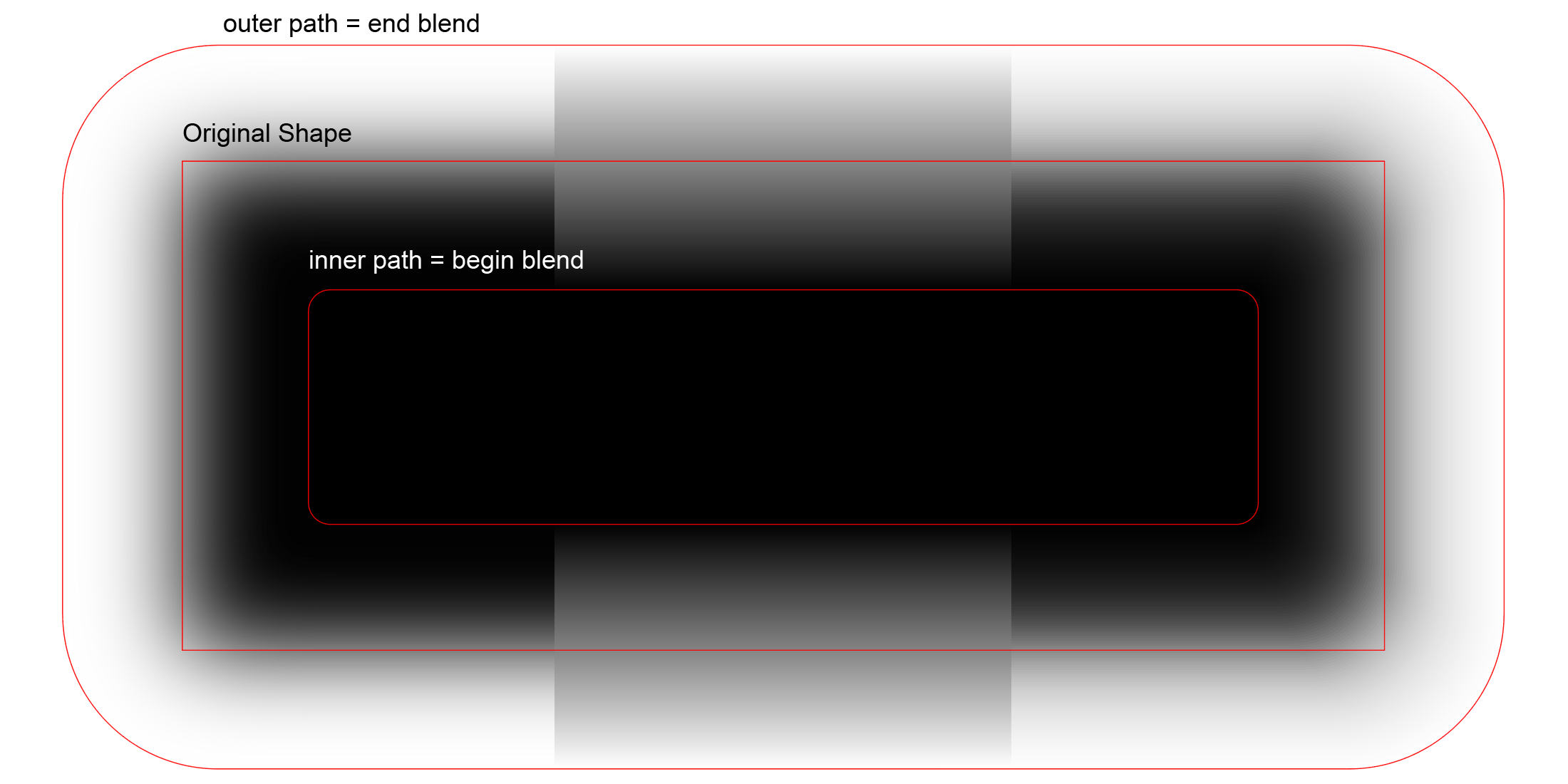
These are the paths that were used to create the blends:
You can see that the blend in the middle looks nothing like the Photoshop blur. However, the corrected blend at right looks really good.
In Real Life
How is this useful in real life? Here’s an example:
I’ve made the shadows a bit darker than usual so that the differences stand out.
Results will be much better when the beginning and ending paths of the blend have the same number of anchor points, distributed in the same manner.
As long as the outside path is generated automatically (Object › Path › Offset Path, with Joins: Round, the results are pretty good.