
TLDR: Illustrator’s default swatches aren’t very good. By using a carefully conceived set of custom swatches, we can replace the Color Panel and increase our creativity.
These swatches provide a complete spectrum and permit changing the colors of an object without making it brighter or darker.
A lot of time in Illustrator is spent in attributing colors to artwork.
Here’s the default Color Panel:
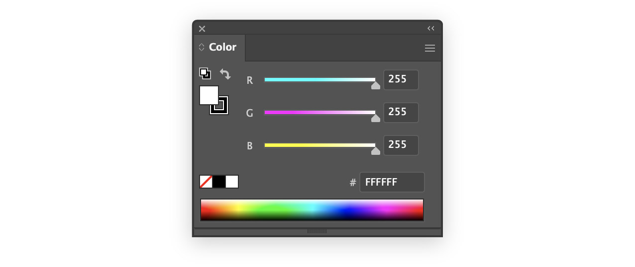
I had always used the spectrum at the bottom to choose basic colors for a new project.
There is a problem with this technique: it’s incredibly imprecise — you can’t pick the same color twice. Each pixel of the spectrum is a different color than the others.
I might pick a nice dark blue for one element of my design, and then want to reuse it elsewhere, in the same or a different tint.
The eyedropper works to match the color, but what about other shades?
I could try click above or below the pixel on the spectrum that I clicked the first time, but the chances of getting the same hue are essentially zero.
A Spectrum Made of Swatches
I decided to replicate the spectrum panel in swatches. That way I could have the benefits of a wide choice of colors, but I could more easily pick the colors I wanted.
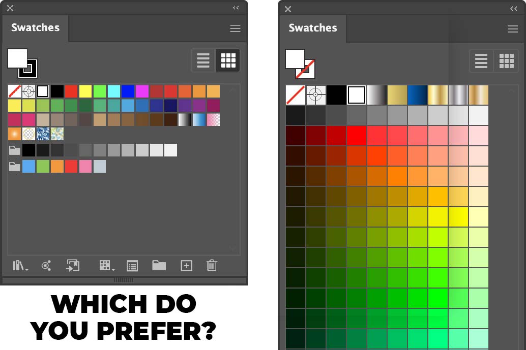
These are the default swatches offered by Illustrator:
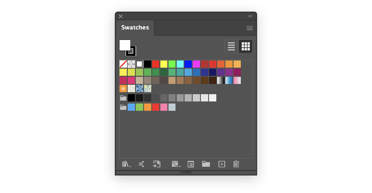
It looks like the Illustrator team wanted to please everybody – there are at least a couple of swatches for any project you could imagine.
But, it’s chaotic and it’s not for me. I want a bunch of bright colors that encourage my creativity.
So I created custom swatches to replace the spectrum panel:
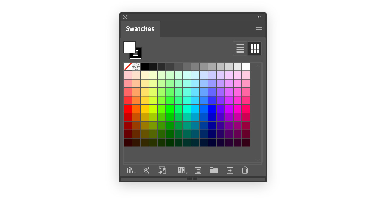
It worked well, but after a few days it started to feel limited. There just weren’t enough choices, and as we’ll see below, many of the basic RGB colors weren’t present.
I’ve been trying to get away from using the eleven basic colors for everything:
- black, white and gray
- red, yellow and orange
- green, blue and purple
- brown and pink
At the same time, I need to be able to use them when appropriate.
How Many Hues?
Adobe’s spectrum is comprised of 360 hues, and the common RGB colors are all multiples of 30:
- 0 · red
- 30 · orange
- 60 · yellow
- 120 · green
- 180 · cyan
- 240 · blue
- 300 · magenta
The spectrum swatches above have 15 columns, which worked out to 24° per hue — of the common RGB colors, only 0:red, 120:green and 240:blue were present.
I wanted to add more colors, but how many hue choices would be appropriate?
I decided to use 24 different hues: one for every 15° (24×15=360).
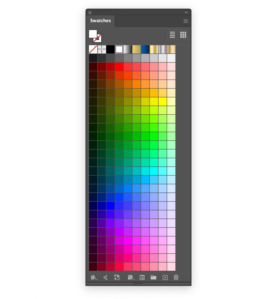
Fitting More Swatches
I wanted the swatches panel to look good at its default width, so I couldn’t add nine columns.
I decided to rotate the spectrum:
Using larger swatches (Medium Thumbnail View in the Swatches hamburger menu) gave me a good choice of tints, and let me use as many rows as I wanted.
This palette worked great and I could have stopped here.
We Can Do Better
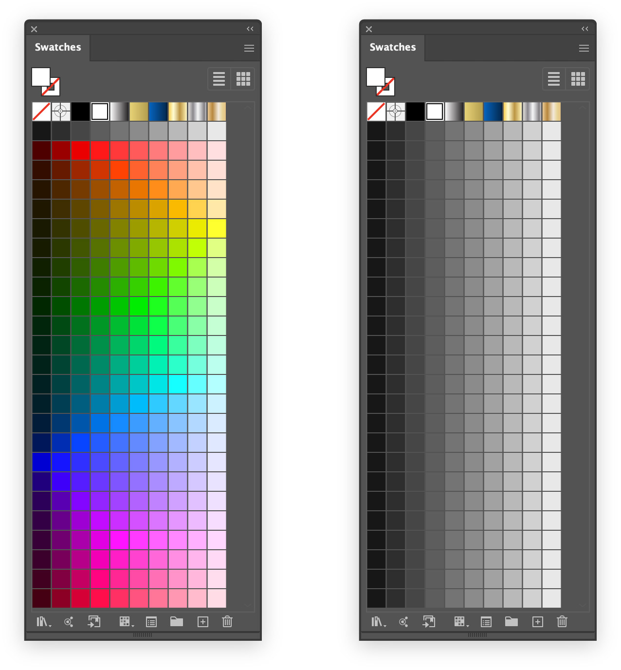
After using the above swatches for a few days, an issue that had always bothered me in the background started to crystalize.
Different hues differ greatly in brightness. If I make a grayscale version of the above image, it’s obvious:

The blues are much darker than the cyans, for example, and the reds than the oranges.
Let’s say I’m working on a simple document, and I’m trying to choose a headline color:
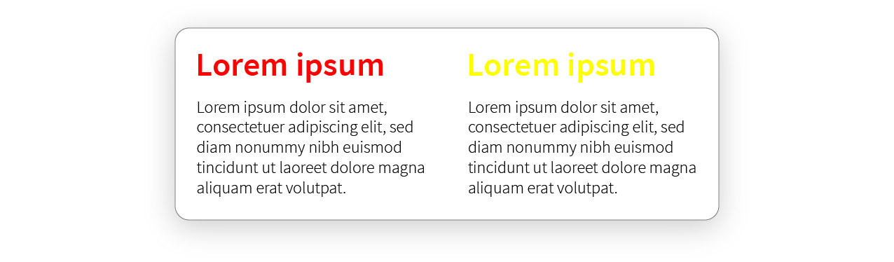
It would be nice to choose the appropriate brightness then experiment with different hues.
Unfortunately, since the brightness changes as I go down the swatches, I have to zigzag back and forth to find the right hue. Smallest violin, right?
What if I created a set of swatches with the same color variations, but while maintaining uniform brightness in each column?
A single column of swatches should all have the same brightness.
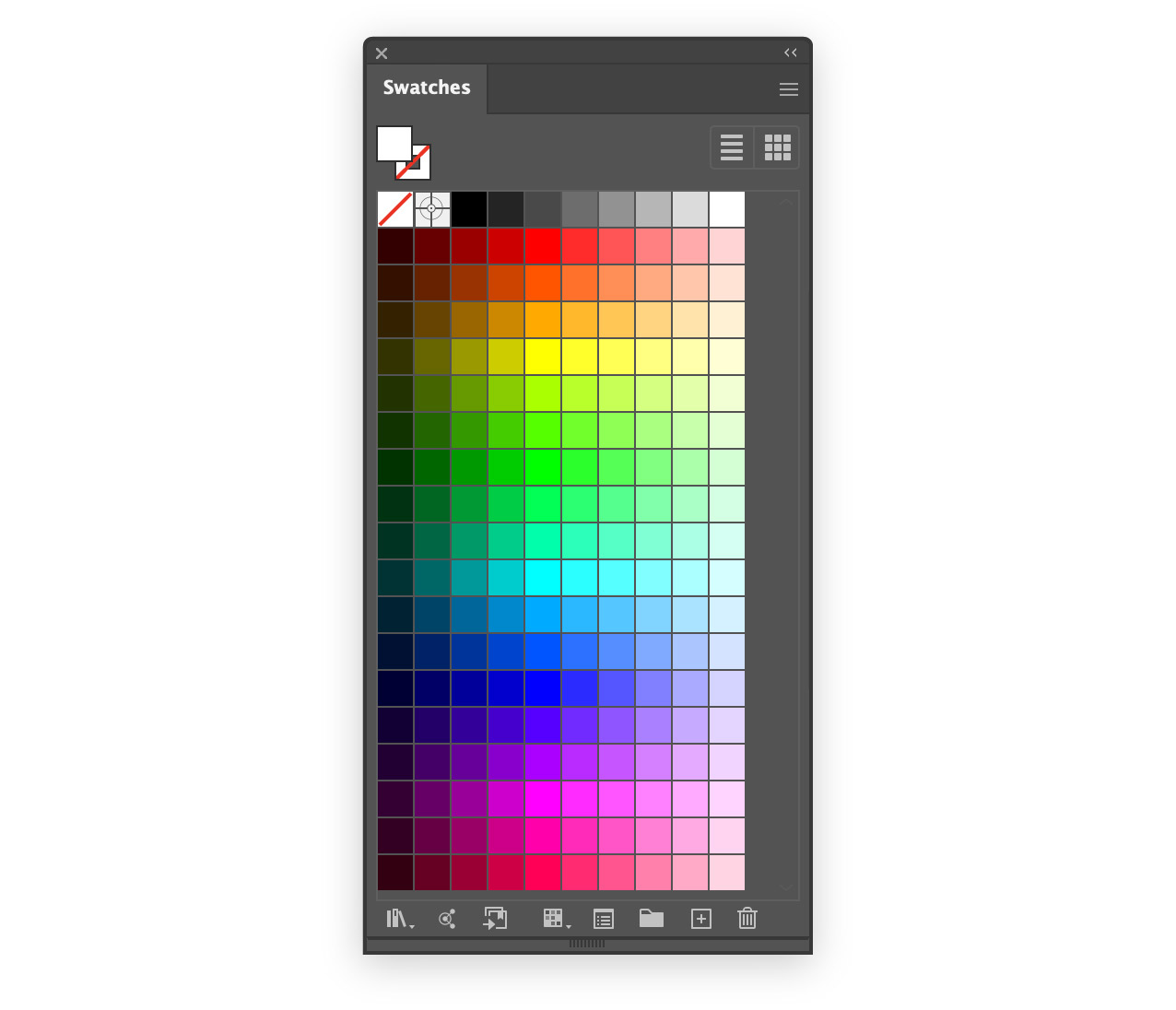
This is what I came up with:
Although the brightness is mathematically perfect, some swatches look wrong — red, yellow and blue clash with their neighboring swatches.
Manual Tweaking
To create the final swatches, I just modified the swatches that were obviously out of place. Here’s what I settled on:
I’ve been using these swatches for about a year and it’s been great.
If you’d like to try them yourself, you download them here.
Tip: save a template with these swatches and you’ll never have to load them again.