TLDR: by default Illustrator panels are displayed in groups of three. While working, the screen quickly becomes cluttered with unused panels.
By grouping all the panels together, the workspace remains open and uncluttered — only one panel is ever open at a time, and opening a new panel automatically closes the previous panel.
This tip is for experienced users — it requires frequent use of keyboard shortcuts.
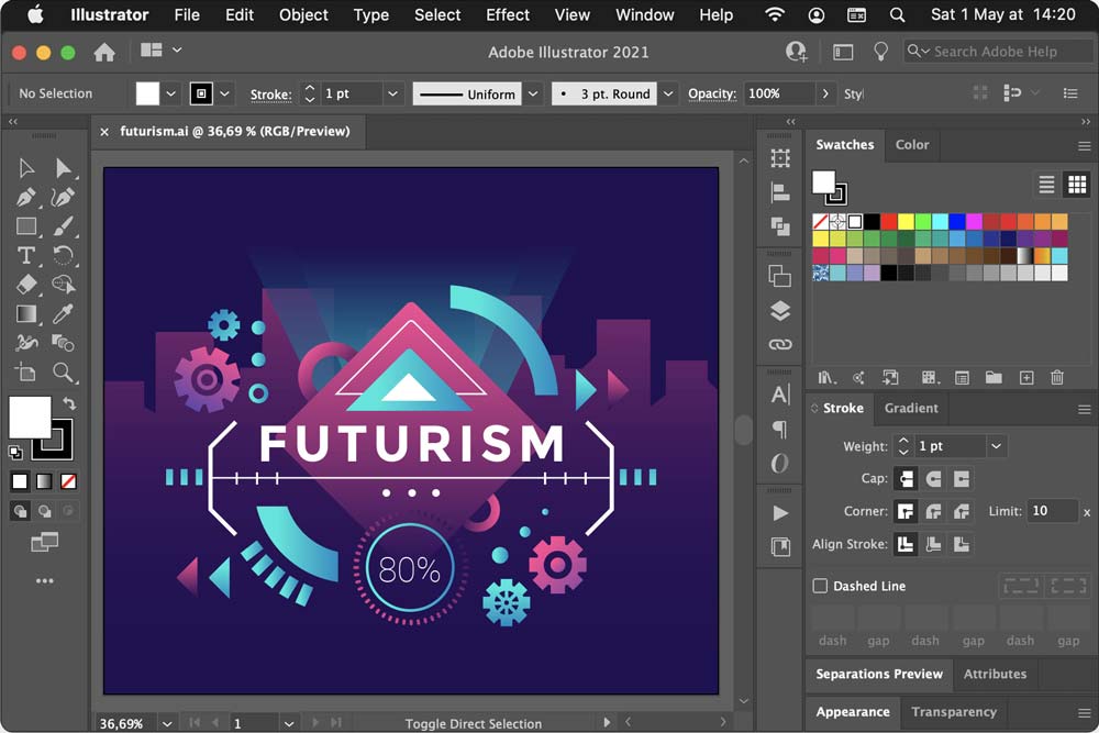
When you open a file in Illustrator, this is what you see:

A large part of the screen is occupied by tools and panels.
By default, the panels are shown in groups of two or three (Swatches and Color in the above image). The defaults never worked very well for me; the few panels I used all the time were interspersed among many panels I didn’t need at all.
I have been using Illustrator since 1995, and I have tried lots of different ways to organize the panels. I’ve stacked them and combined them in countless systems of frequently combined actions, related panels etc.
In the end, the panels always ended up getting scrambled and my Illustrator experience was needlessly chaotic.
About a year ago I had a thought: closing panels I don’t need takes a significant amount of time; if I combine all the panels into one then opening one panel will automatically close the previous panel!
Then I thought: no that’s crazy.
Then I thought: well, I’ll try it for a few days and when it doesn’t work I’ll put it back.
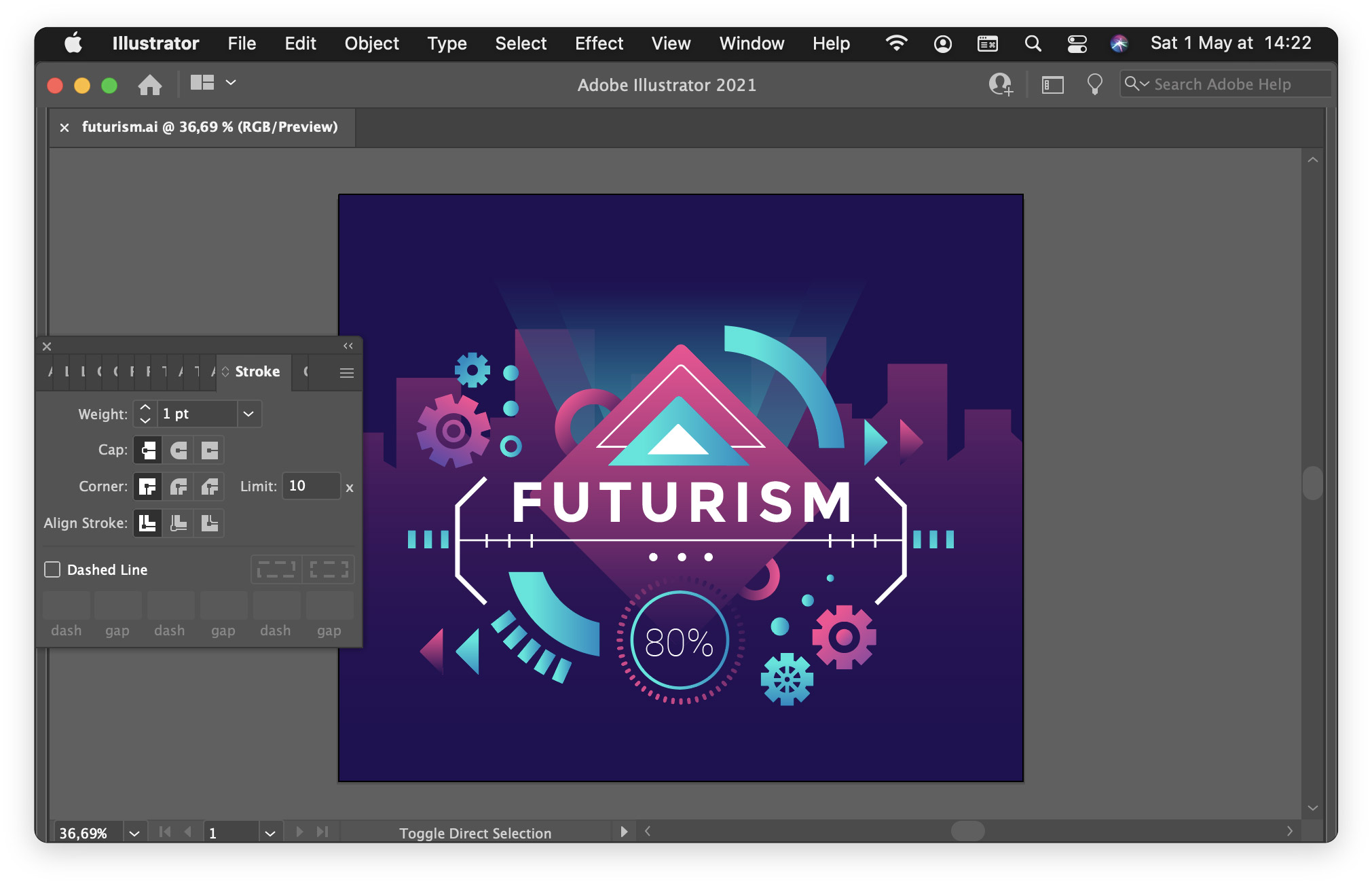
This is what it looks like:

As you can see, choosing panels by clicking on the title bar is no longer possible — you have to know the keyboard shortcuts to get to the panel you want.
But it’s glorious! I can see the whole document, and each time I open a panel I need, the previous panel disappears!
Filed under: not for everyone.

