
This post is about this page — you might want to look at it before continuing.
First, let me be clear: pourover makes the best coffee.
I’ll drink anything rather than go without, but pourover is the way.
I knew this when, after having bought more than fifteen different coffee making apparatuses, including four æropresses, I was drinking coffee at my mother-in-law’s house and thought: mais comment ça se fait que ce café est si bon ? (she’s French).
And I knew that the way, c’est du pourover (if you prefer espresso, I won’t judge you out loud).
This isn’t the post I set out to write
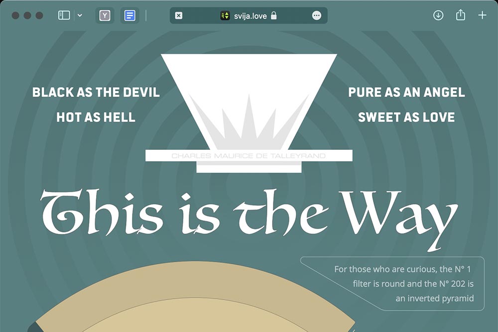
I started out to write an elaborate post about all the cool stuff you can do with Svija.
As part of the process, I created an infographic about coffee filters, then turned it into this web page:

It turned out that I couldn’t find much to write — creating a website with Svija is just like other graphic design.
In this case, it took me:
- eight hours to design the main infographic
- 50 minutes to design a mobile version
- 40 seconds to convert the fonts for web use
- one press of a button to turn it into a web page
So, no long article — I’m not going to write 1000 words about pressing a button.
Svija is a tiny product, practically invisible — you design like you always have.
And, if you feel like making that into a website, well now you can.
How does it work?
I’ve been assuming that you know how Svija works. If you don’t, the thumbnail drive version is:
- you design normally in Adobe Illustrator
- there’s a minimal Mac app that uploads your changes constantly
- there’s a tool panel in Illustrator to save the page
- an admin website lets you add new pages and decide which Illustrator files will be shown
Svija vs. making a similar page in HTML
If I had wanted to present the same information on a traditional website, I would have had to make a choice between two bad options:
- do the same work in Adobe Illustrator then include the graphic as a plain image in a regular web page, or
- do a radically simplified version to fit into a WordPress-style theme
Either choice would result in a mediocre experience for my visitors.
But more importantly, in this case, I had fun. The whole process was a blast.
- I never had to fight with my tools
- I was never blocked from moving or resizing an element as I would have been if designing in HTML
- I could use any fonts and shapes, transparency, curves, and long continuous lines, all impossible in HTML
The whole process was creative. There was no administrative stuff — no fighting with a CMS etc.
It did take me 45 seconds to convert five fonts at convert.io (it would have been faster but I’m too cheap for a paid account and can only convert two at a time).
Let that sink in: I did a beautiful web page, one that would be impossible with any regular website builder, and it was fun, (and it’s Google-indexable, accessibly readable etc).
Are there mistakes in my infographic?
I actually don’t know anything about coffee filters, although I did obsessively measure the ones used for the graphic.
I’m sure the kind souls on the internet will correct me if I’m wrong about something.
And you know what? With Svija, I can make corrections in less than 30 seconds.
The next step: animation
The one flaw with this graphic is that it’s static.
We’ve gotten to the point where website animation, at least for a marketing website, has become de rigueur.
The coffee-filter page suffers from an absence of movement. So, I’m going to add some animation.
I won’t add anything too radical, but some dyamic scaling, a little rotation, some gentle surprises, and a few mouseovers will really make the page come alive (h/t Mick Jagger).