
TLDR: for various reasons, the Effect › Stylize › Drop Shadow… effect cannot always be used. The best alternative has been Illustrator Blends, but the blending is too abrupt and visual quality suffers.
A custom ActionScript redistributes the opacity values of an Illustrator Blend, making it look almost exactly like the bitmapped Stylize effect.
Stack Exchange post · download this script
I use a lot of drop shadows in my design work. Although Illustrator supports the creation of drop shadows with Effect › Stylize › Drop Shadow…, this is usually unusable for me, for a few reasons:
- I’m usually building SVG web pages, and the drop shadows are stored as placed PNG images that can’t be included in the page
- I’m creating a logo in a .ai file that will be placed in another document, and any placed bitmapped images are rendered as external PNG images
- I’m creating assets for a macOS application and external linked images aren’t used
SVG does include the ability to create drop shadows via filters, but this has a couple of serious drawbacks:
- SVG filters are rendered as pixelated images — the incredible precision of vector-based artwork is lost
- SVG filters significantly slow down page drawing in Illustrator and make modifying a complex page unwieldy
Blend-based Shadows
The best solution, if it worked, would be Illustrator blends:
- they’re easy to use
- they’re extremely lightweight
- they work perfectly with SVG pages and placed .ai files
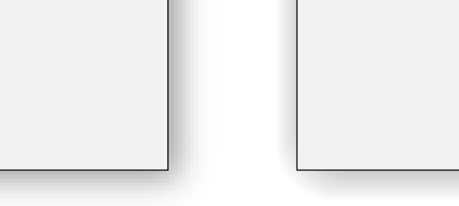
The problem with blends is just that they look bad:
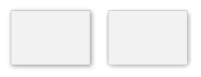
On the left is the Effects › Stylize shadow, and on the right is a blend. The edges of the blend are much less soft:
There’s no reason this should be the case. It’s just that Illustrator blindly calculates all the intermediate steps of the blend at even intervals.
A Better Blend
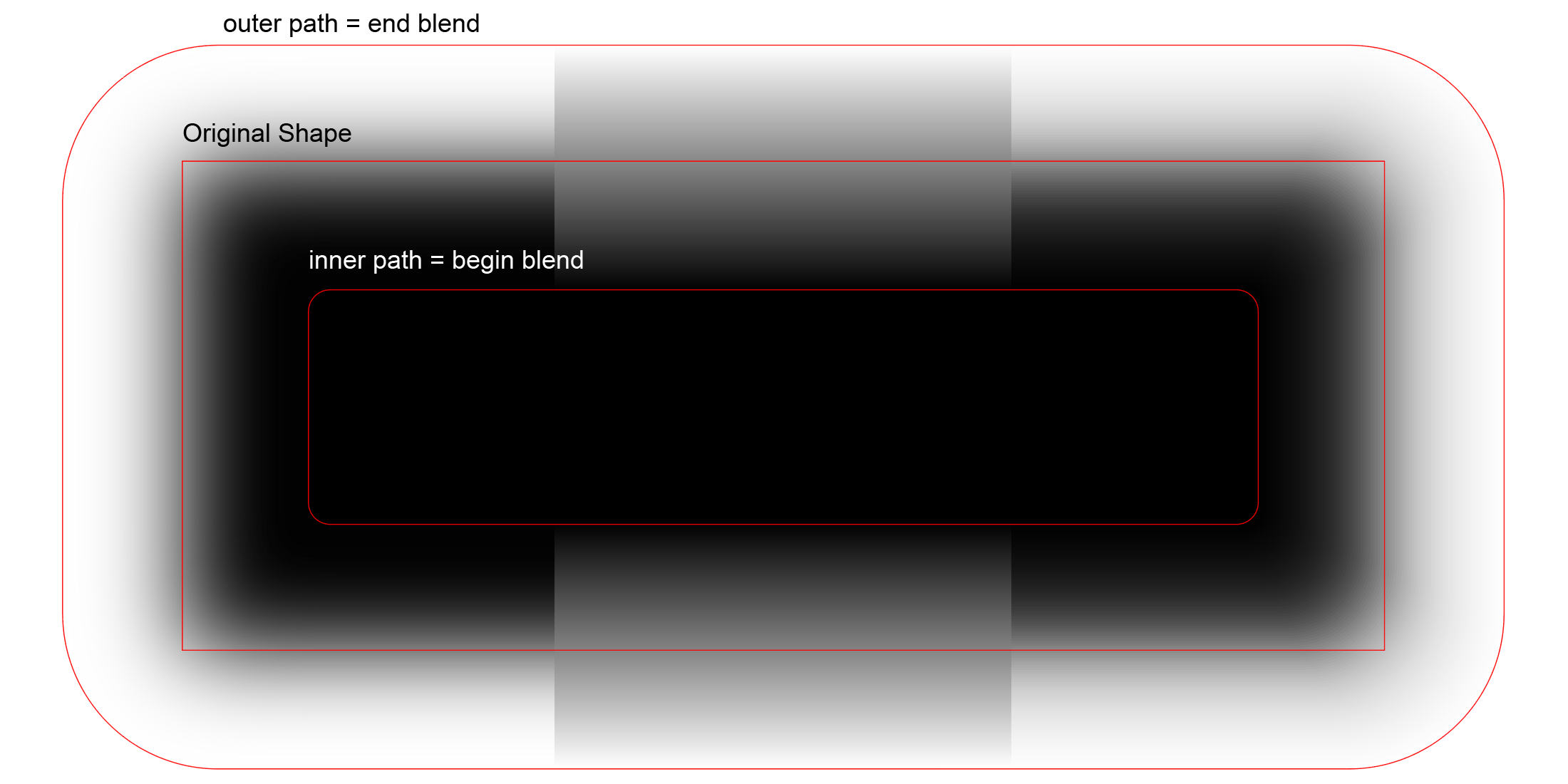
So I wrote a simple ActionScript that redistributes the steps of a blend along the arctangent curve.
It’s a nice S-shaped curve that’s easy to calculate in Javascript.
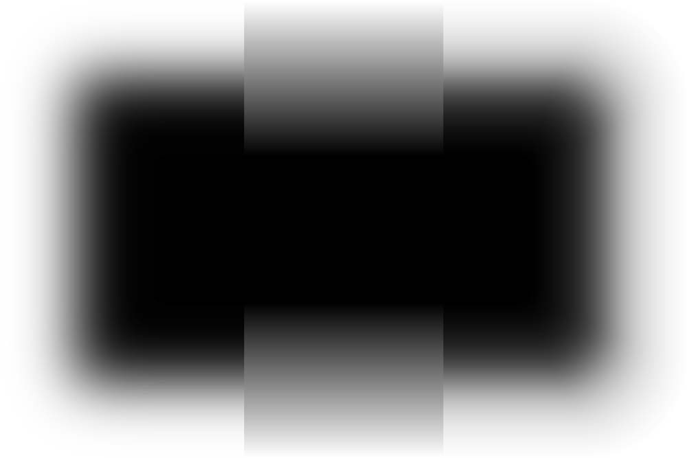
Here’s the result — at left is a Photoshop blur, in the middle is an Illustrator blend, and at right is the ActionScript:

These are the paths that were used to create the blends:
You can see that the blend in the middle looks nothing like the Photoshop blur. However, the corrected blend at right looks really good.
In Real Life
How is this useful in real life? Here’s an example:

I’ve made the shadows a bit darker than usual so that the differences stand out.
Results will be much better when the beginning and ending paths of the blend have the same number of anchor points, distributed in the same manner.
As long as the outside path is generated automatically (Object › Path › Offset Path, with Joins: Round, the results are pretty good.